AVG Retail Packaging
Making AVG’s software range easier to shop
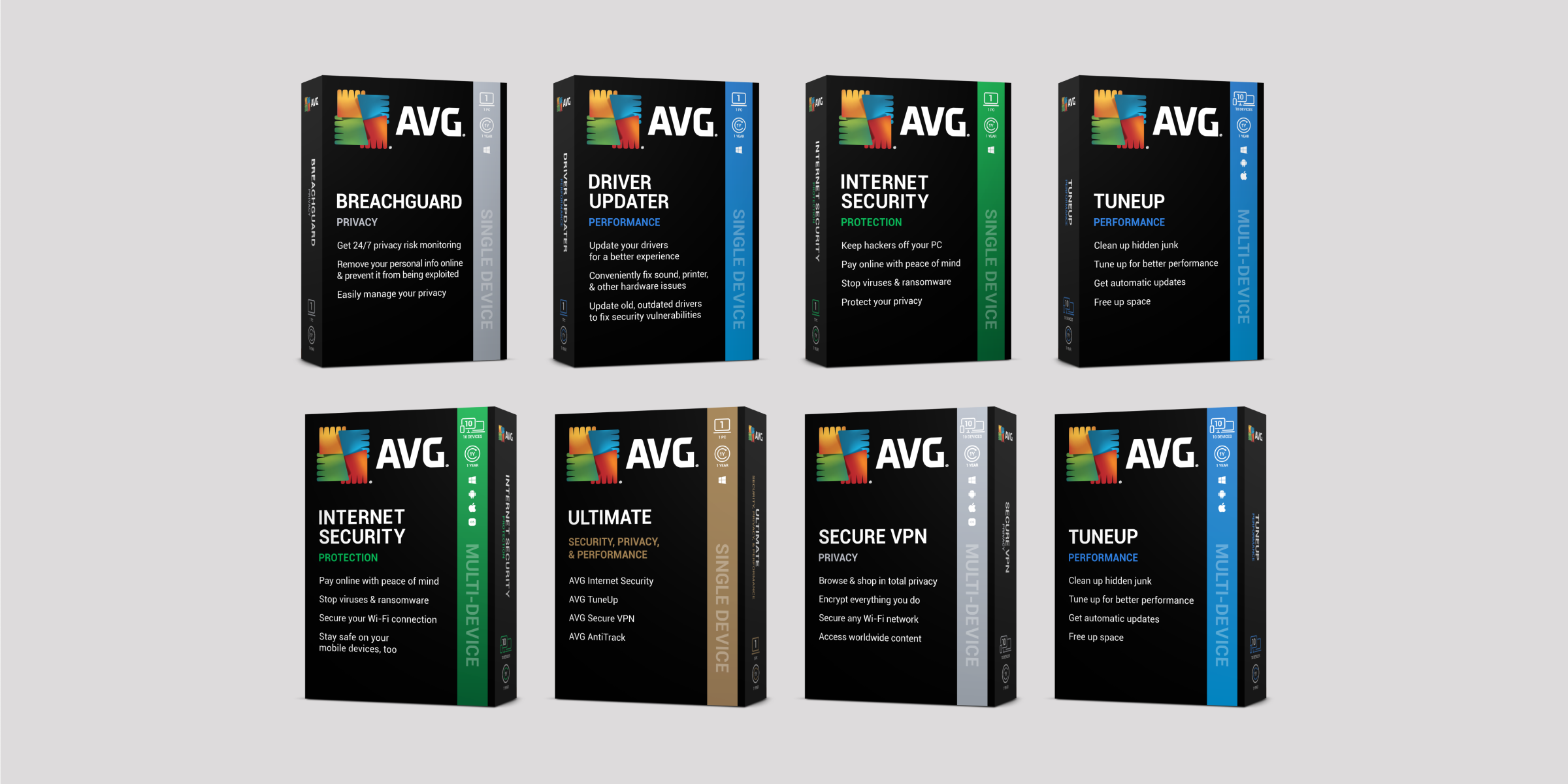
On a software shelf, shoppers need to see which product does what and how many devices it covers. As part of the wider Avast and AVG retail rebrand, we redesigned AVG’s packaging around those decisions. A shared black pack front brings the range together, while a colour-coded strip picks out each product and its device coverage.
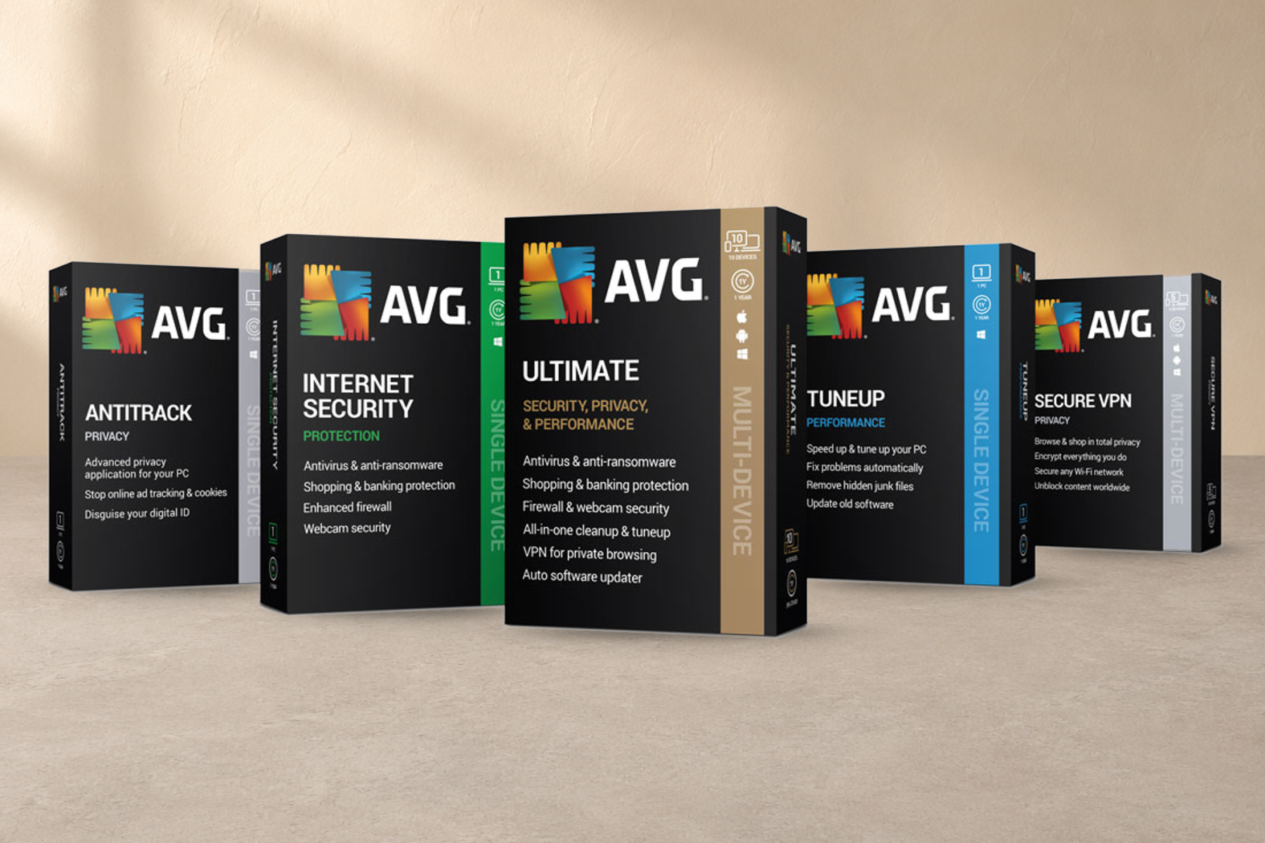
We carried the design across slimline boxes, activation cards and supporting retail materials for global distribution. For online retailers, we created a set of realistic 3D pack renders. Shoppers could recognise the same box whether they found it on a shelf, on a product page or in a campaign.
Keeping the range consistent from artwork to press
Internet Security, TuneUp and Ultimate all needed to look like AVG, while giving shoppers a clear reason to choose one over another. We kept the logo and product name in the same position on each box. Beneath them, a short feature list explains what that particular product offers.
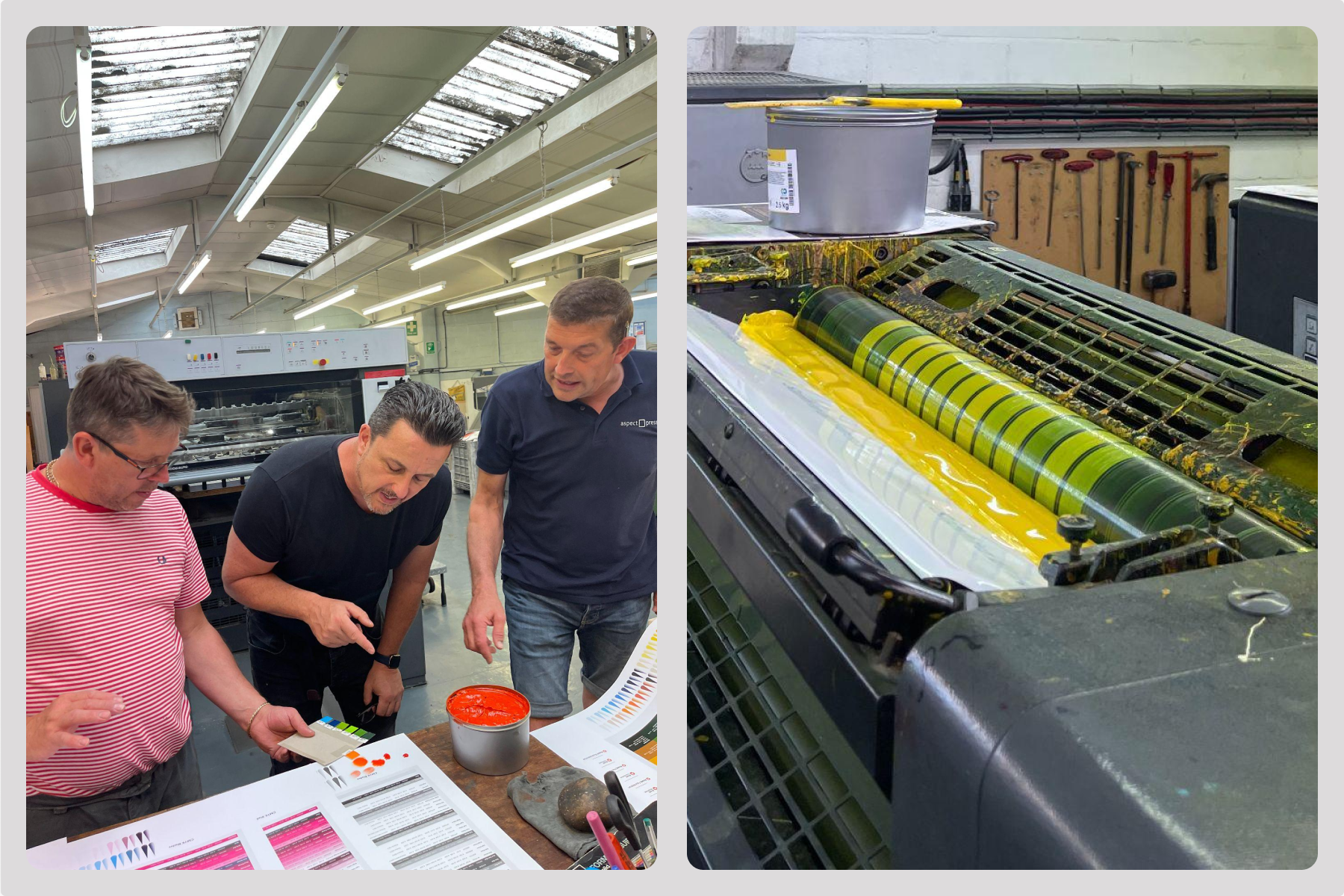
Colour was doing real work across the range, so getting it right in print mattered. We managed the artwork through colour matching, press checks and final print sign-off. The finished packs and their digital counterparts share the same visual cues, right down to the coloured strip that distinguishes one box from the next.