Reimagining a Craft-Led Brand for Modern Growth
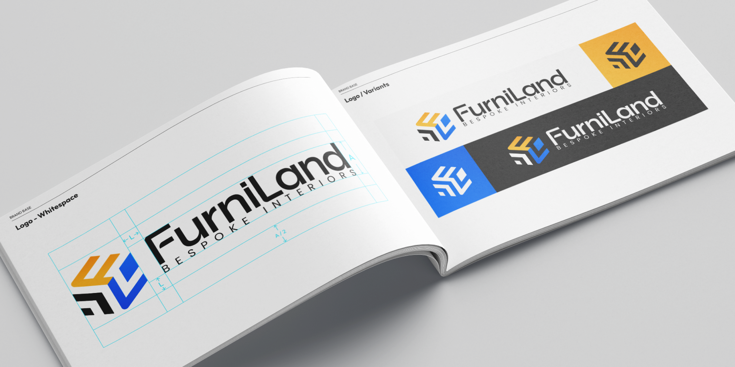
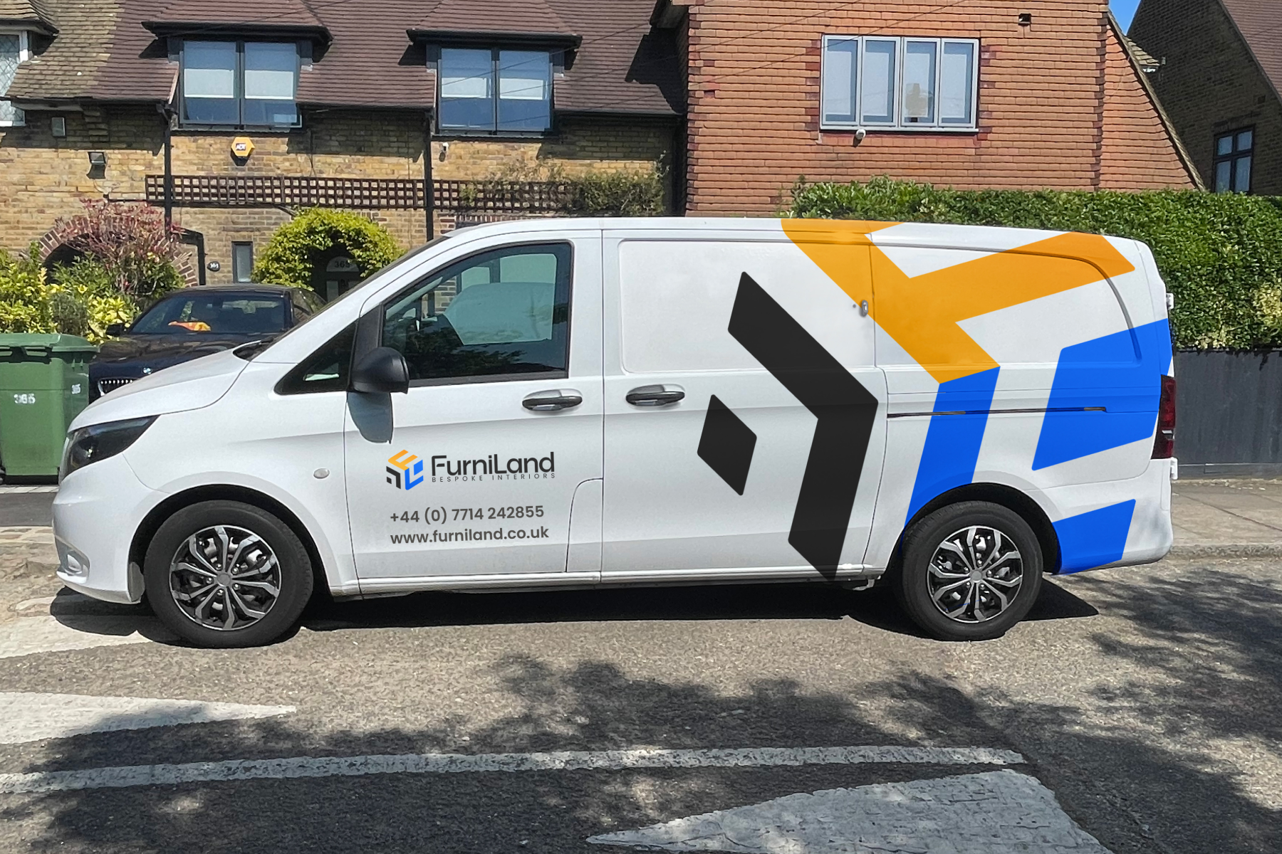
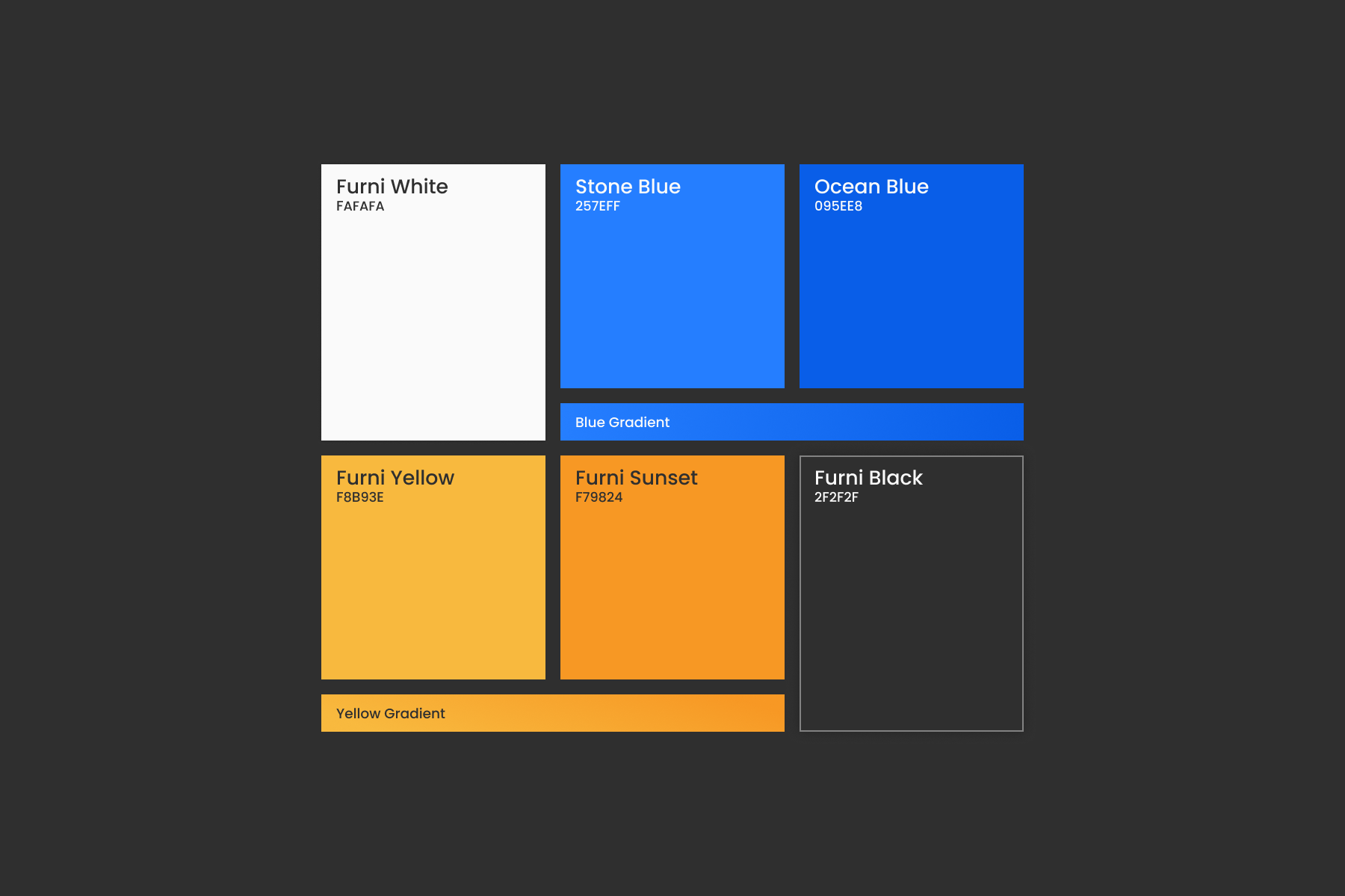
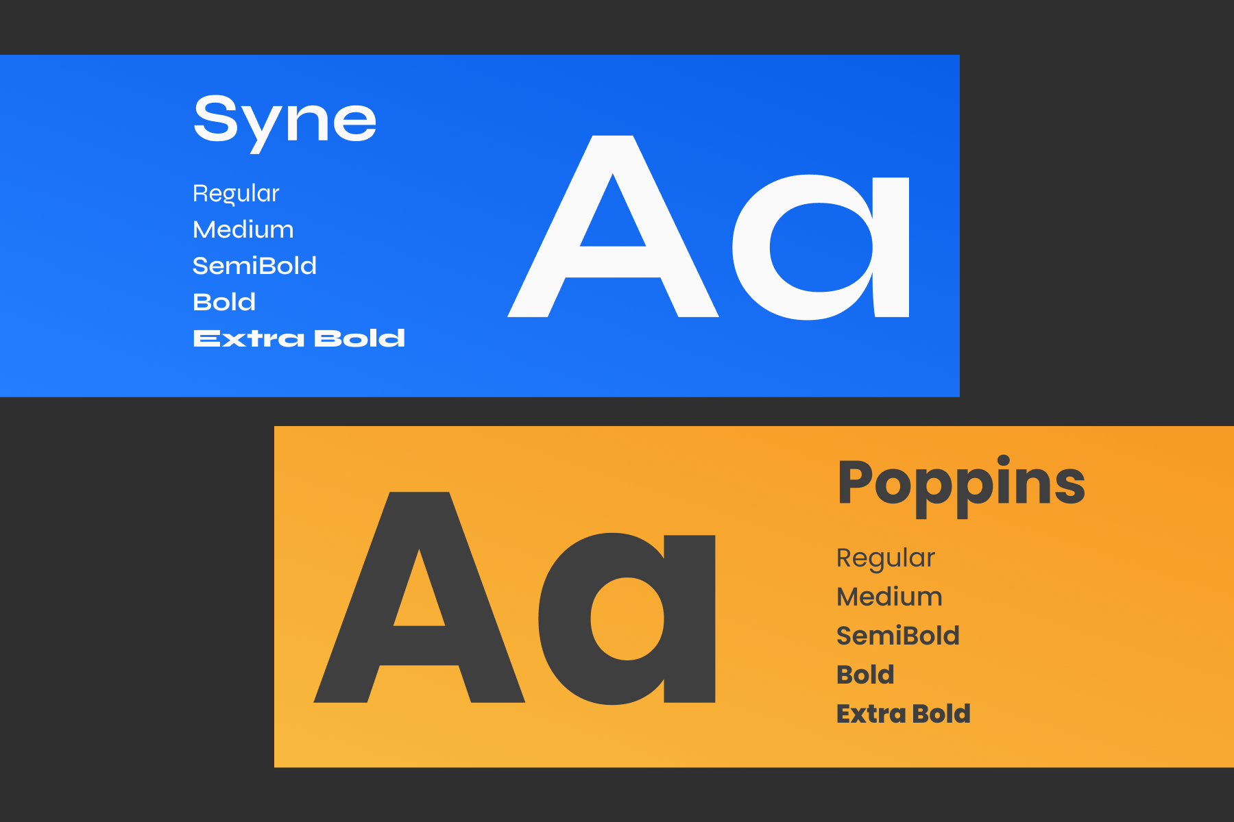
Furniland approached Hatch to modernise their brand and bring greater clarity, confidence, and cohesion to their visual identity. While their craftsmanship was strong, their brand presence did not fully reflect the quality of their work. We developed a refined identity system built around considered typography, confident colour application, and a flexible visual language that could scale across digital, print, and physical environments. As part of the rollout, the new identity was applied to vehicle livery, ensuring consistent brand visibility beyond traditional touchpoints.


Elevating Perception Without Losing Practicality
The existing Furniland branding lacked consistency and impact. It needed to feel more contemporary while remaining approachable and grounded in skilled workmanship. Our challenge was to balance modern design principles with the authenticity of a trade-led business. The identity had to feel premium but not corporate, bold yet practical, and flexible enough to support future marketing activity. The result is a cohesive brand system that strengthens recognition and positions Furniland with greater confidence in a competitive local market.