
Visualising Sound Through Brand Evolution
AMC, a Lithuania-based audio technology company, approached Hatch to evolve their brand beyond its existing logo. The ambition was to build a richer visual identity that reflected the precision and emotional power of sound.
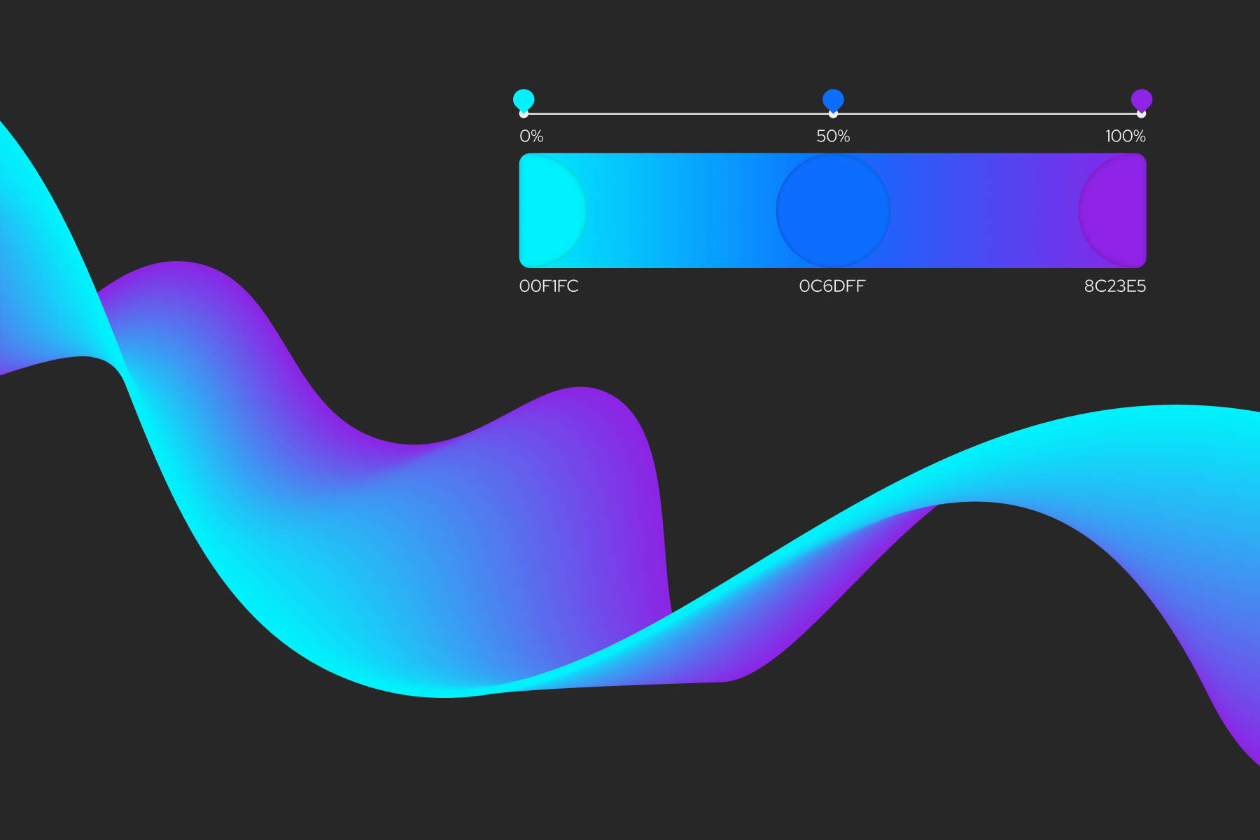
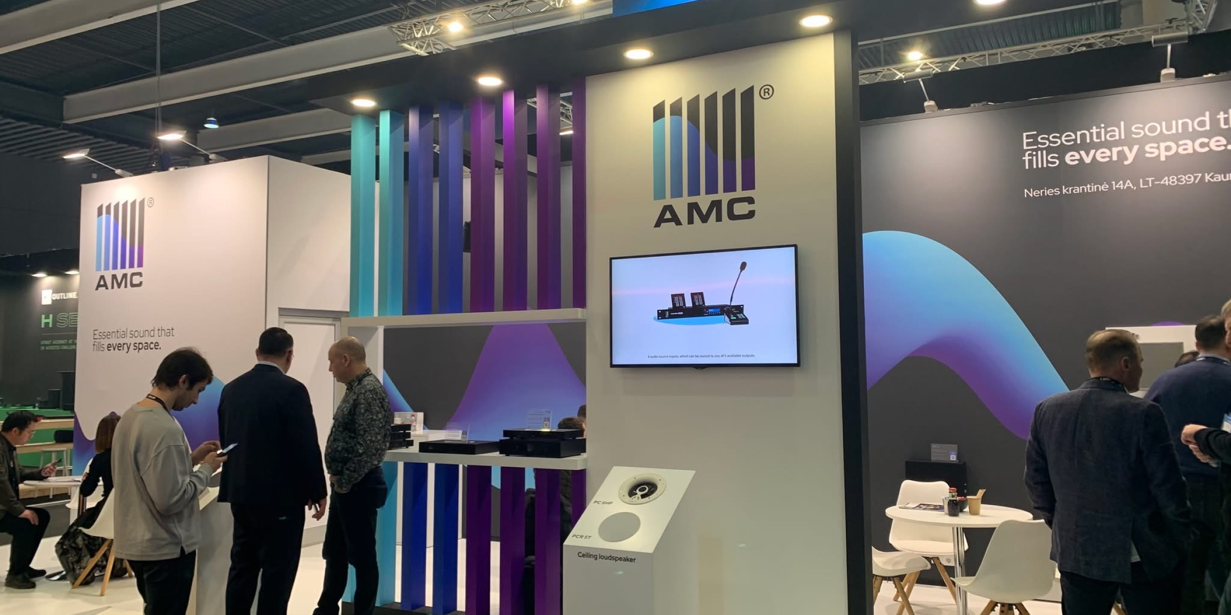
We expanded the brand system through a considered colour palette, defined typography, and a cohesive visual language that could flex across product, print, and campaign applications.
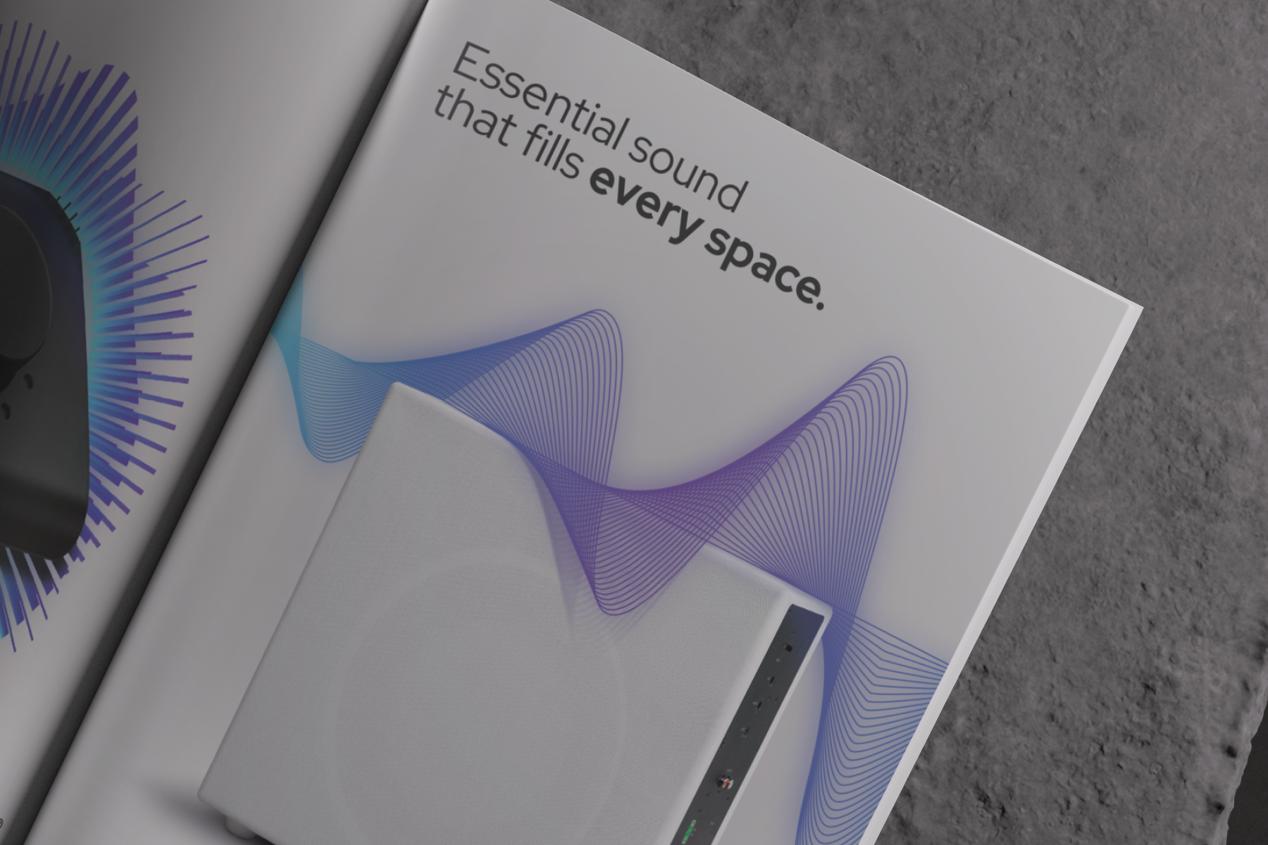
To launch the refreshed direction, we developed a distinctive campaign concept for audio industry magazines, exploring how sound can be visualised through dynamic, expressive graphic forms.

Moving From Logo to Living Brand
AMC’s brand foundation existed primarily as a logo, with limited supporting assets or defined system. This restricted consistency and made it difficult to express the sophistication of their audio technology across marketing channels. Our challenge was to translate the intangible nature of sound into a compelling visual language.
We needed to introduce colour, structure, and typographic clarity while preserving the technical credibility of the brand. The campaign required a bold yet intelligent visual device that could stand out in specialist audio publications while remaining grounded in the product’s performance and engineering heritage.